IN.
the together app
IN. is a mobile app designed to make group travel easier and more efficient, so their users can stay on the same page and IN the moment.
My Role
Contract Designer, Consultant
Year
Fall 2021
Company / Client
The IN. Group
Background
IN. is for people who love to get together IRL with the people they love.
Aimed at taking the hassle out of planning group trips and events, IN. keeps invitations, itinerary planning, and splitting costs with the group all IN one secure place.
Are you IN? Download the app here.
Key objective
I was brought into this project during the early phases of IN.’s development. Using my skillset and expertise, the Client wanted to achieve the following:
Transform initial concepts and brand identity into a scalable, cohesive design system
Analyze existing wireframes and mockups for IN.’s budgeting feature
Clean up UI inconsistencies
Ensure alignment with newly-created design system and industry accessibility guidelines
Make necessary improvements to elevate feature experience and interactions
Initial concepts
Client provided their foundational concept for their budgeting feature, including access points and key functions like adding expenses and viewing/managing existing expenses.
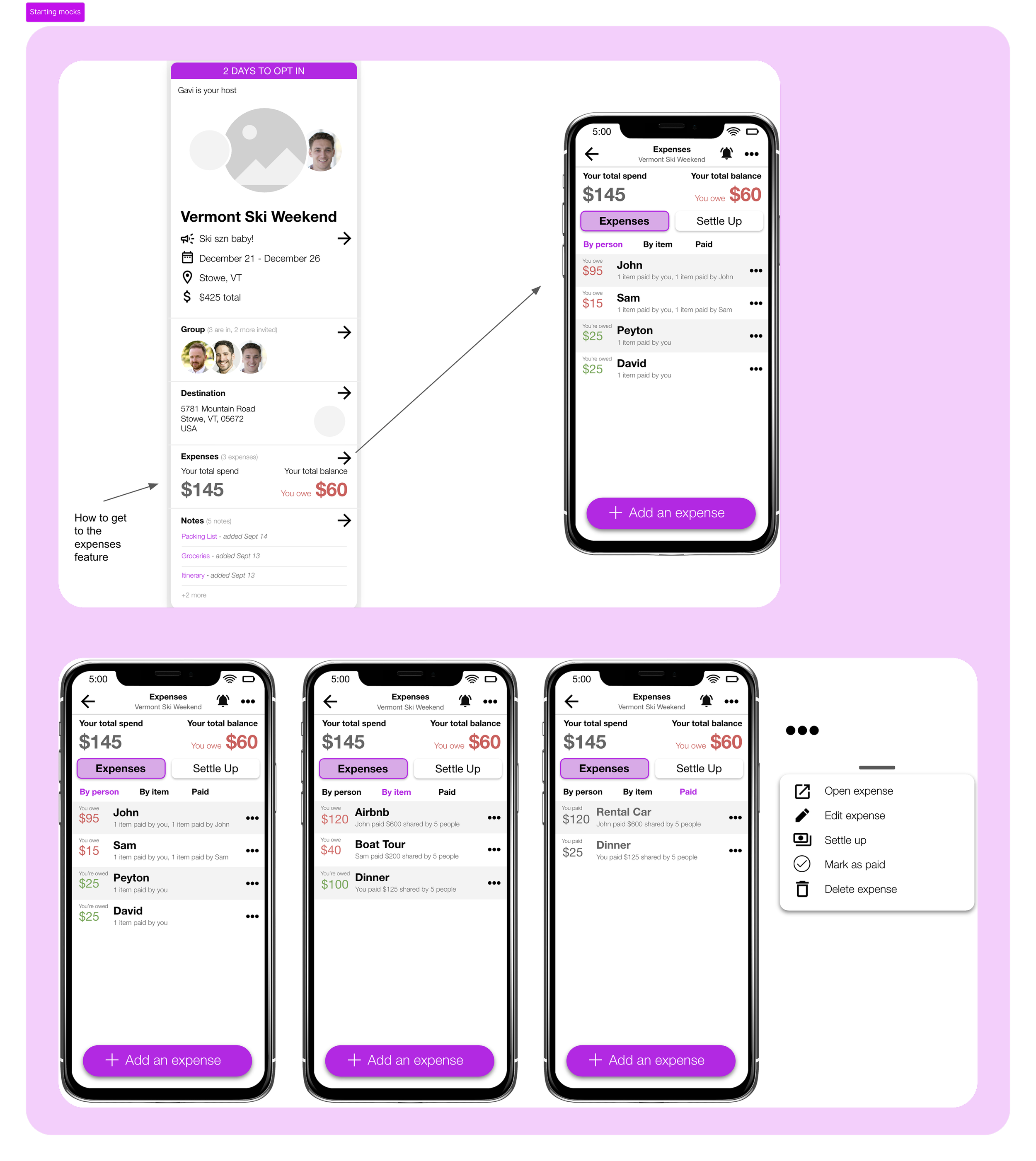
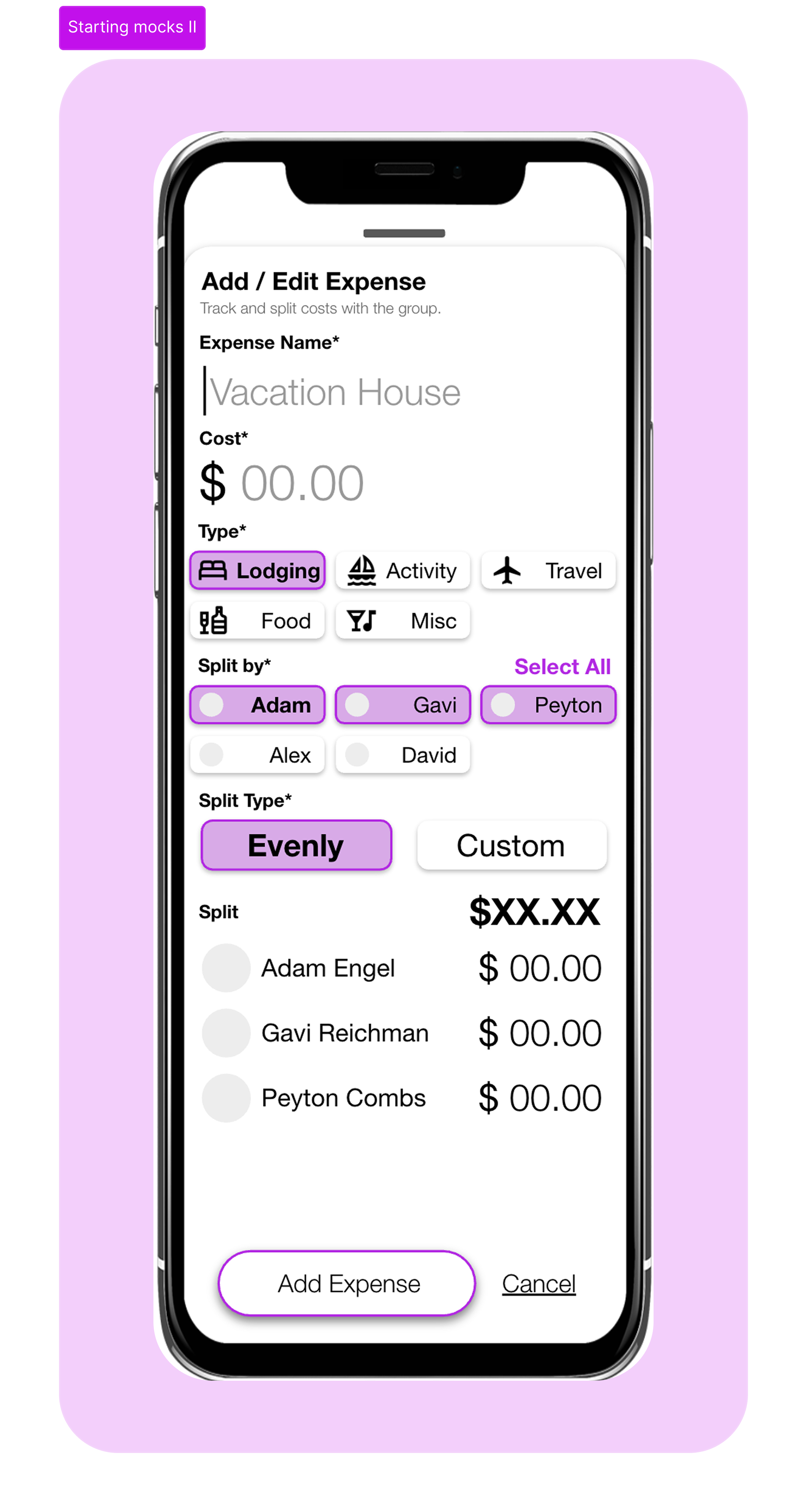
After analysis, I determined the key areas of focus for redesign efforts:
Creating consistency in UI
Establishing informational hierarchy and key user actions
Reduce visual noise
Improve readability and accessibility
Final deliverables
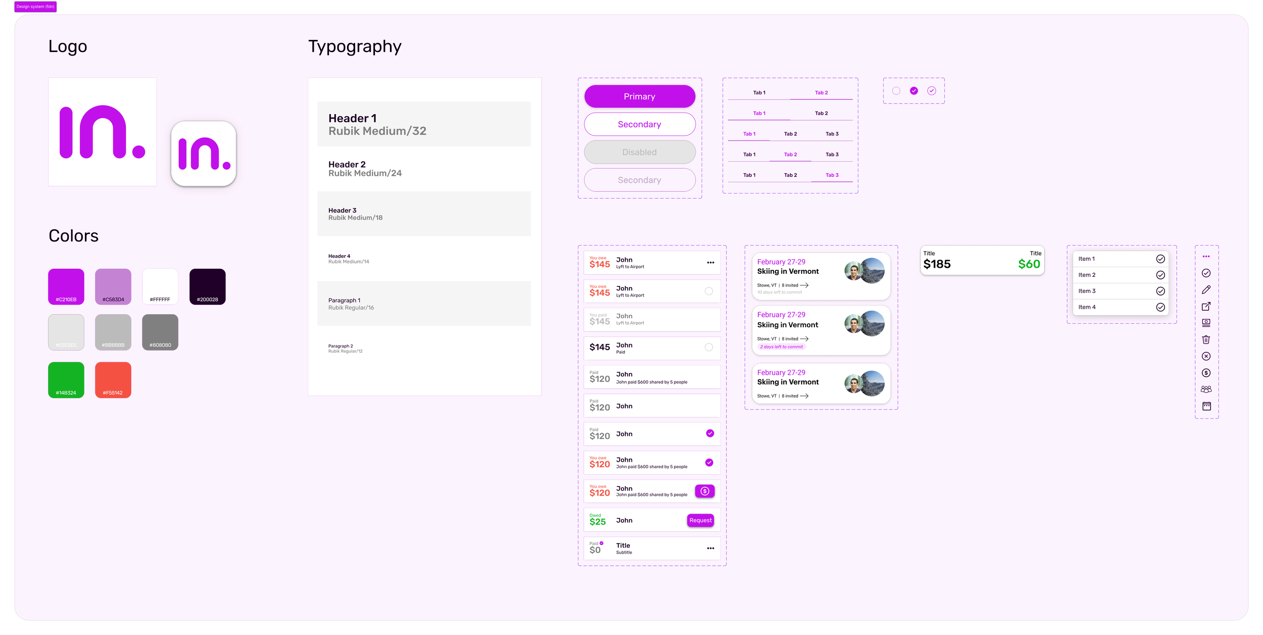
Created a small yet mighty design system to capture key colors, typography, icons, and components. Intention was to create a scalable system that could create visual cohesion as more features are defined and implemented across the app.
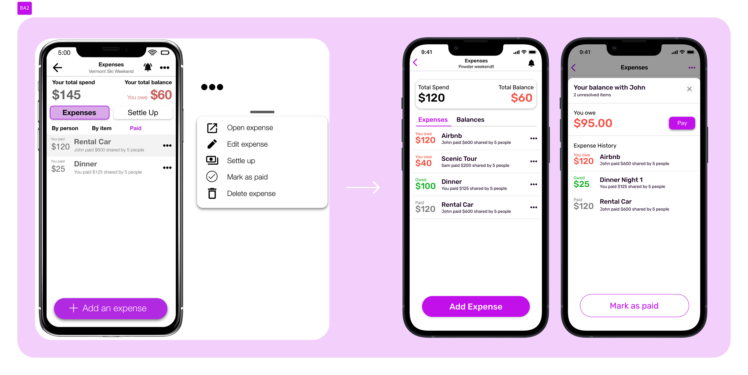
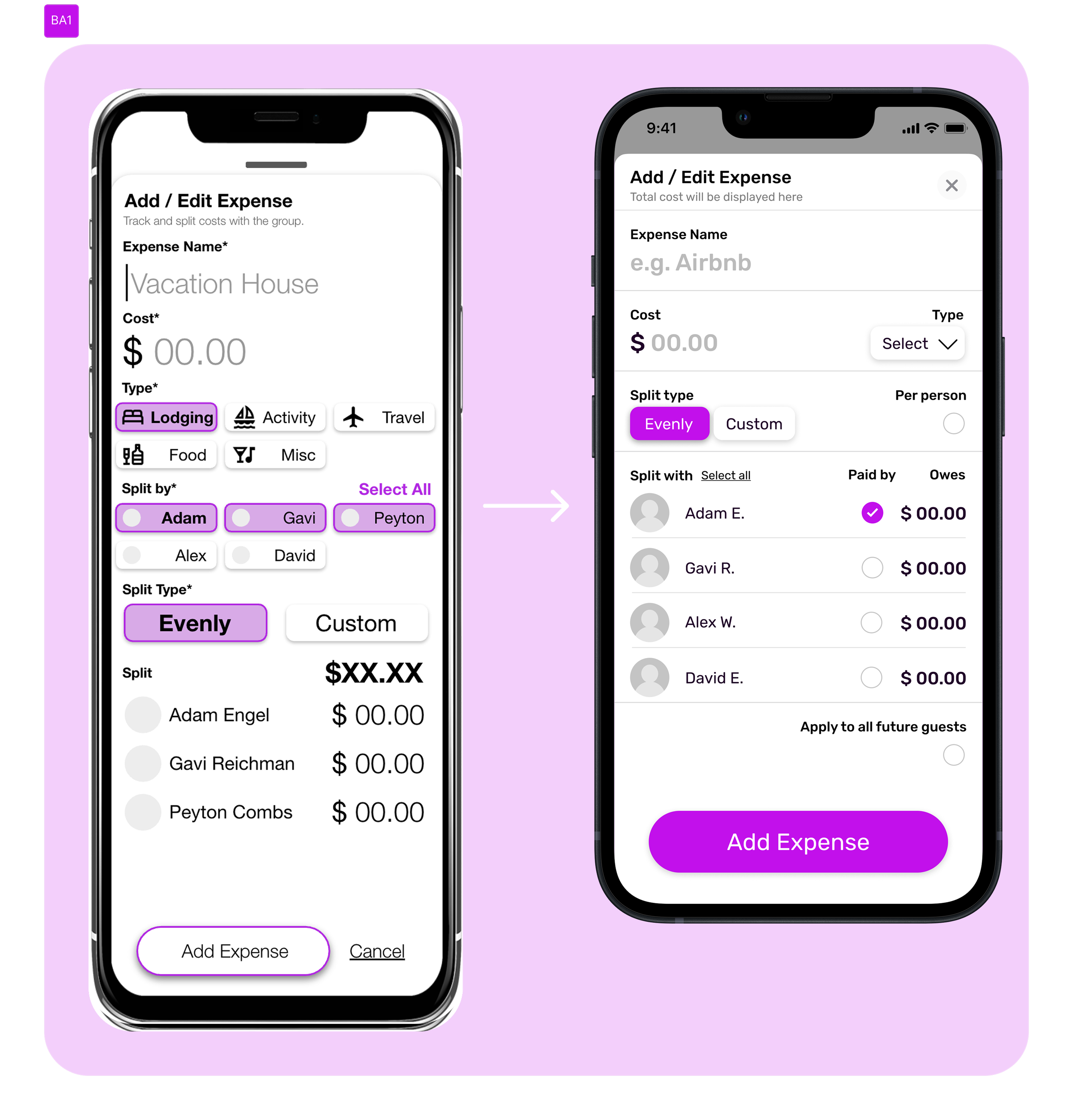
When applied, the design system successfully unifies visual elements and establishes a hierarchy to make primary actions clear to the user. Color is used more intentionally, resulting in better visual clarity for users when viewing their expenses. Redesigned layouts remove and/or repurpose unnecessary elements, add more space between elements, and enforce a more consistent typography. Doing so ensures each screen becomes more intuitive, readable, and easier to understand.
Key learnings
Working with The IN. Group and the IN. app stressed the importance of having a simple and strong design system.
A strong design system is critical to ensure screen-to-screen consistency. Consistency results in predictability, which leads to users having a delightful and positive experience that aligns with the brand’s mission and vision for success.